Showing posts with label design. Show all posts

Tuesday, 17 January 2017

Create Quote Memes & Images For Instagram and Beyond!

In recent years, when I've wanted to create an image for the blog or as a background to a slide, or whatever, I've gone straight to Picmonkey and it's done the job perfectly, as well as speedily (I'm not sponsored by them, promise! In fact all my tutorials utilise the free features only, but I do upgrade my membership when I have a few pennies because the font selection is on point)

If you haven't tried it yet, do! Today I want to share my favourite way of making fun quote images for my Instagram feed. I've started trying to curate my Instagram feed a little more, and it's really paying off.

Here's a little tutorial on how I make my cosmic quote images - for more, come over to my Instagram feed ---> here

1. Find your quote - I picked one that reflected by aspiration for the year, to live more in the moment! Don't forget, if you use a quote by someone else, which many will be, it's ethical to give a little credit.

2. Head over to www.picmonkey.com and select 'Design' followed by 'Blank Canvas'

3. Choose a font, either from Picmonkey's library or one of your own. The font works better with a plenty of black space-  and write your quote in big  lettering in the centre (or, at a quirky angle!)


4. Now, you need a background. I like to use royalty-free images by NASA for a cosmic feel but you could use anything at all. Busy patterns work best. Select the little butterfly icon and then chose 'Add Your Own' - you can then select any image from your computer. It'll plonk it over the top like this:


5. Super simple - use the Overlay toolbox that pops up to select the Blend Mode 'Add' This will fill all the black space in your writing with your image. You can move it around using the little arrows to get the best placement. Then save and BAM, you have a tailored, original quote image to share.


I don't bother with this at the moment, but you could pop your name in tiny writing at the bottom and apply the same technique, if you are worried people will reshare your work and not credit you for it.

I can think of SO many uses for this snazzy trick - blog headers, infographics, cover photos...I'd love to see what you do with it so please do tag me in your images if you use my tutorial.

Keep an eye out, I'll be sharing how you can get access to, and then use, Instagram insights to boost your following and start earning money through your Instagram later in the week. Have a great day!

Sunday, 24 January 2016

The Road To Success

When I was younger, this poster was hung in my house. It got taken down and probably thrown away when my parents moved, I spent a number of years trying to recall exactly what it said...


It's pretty intense, so many ways to end up in Failure River, only a few tiny stick figures reaching success. 

The poster was originally printed in 1913 for the National Cash Register company, one of the first examples of a 'motivational poster'. I definitely prefer this to a generic picture of some balancing rocks, a sunset or a snow-capped mountain - I hope you like it too.


Tuesday, 2 September 2014

How To Remove The White Borders on Images In Your Blogger Blog

Hey there:) The little fellow went back to school today and I am back at the computer, pimping myself out on Peopleperhour.com and generally reacquainting myself with the internet after a few weeks of flu & summer holidays.

I still get daily comments on my 'How To Make A Perfect Circle Picture' blog post. Which surprises me really as Picmonkey now have an option to use a circle shape 'cut out' that does the job a treat. Still, I love getting comments and people reading my blog so I'm not complaining in the slightest.

One of the comments I get a lot is that readers have created their circle picture and added it to their blog, but Blogger seems to have added a white shadow border to the image. This is happening because the Blogger template that you are using has a piece of code written into it that overrides any other other options you may have selected. Luckily Blogger provides a handy little widget to insert new overriding code and that is what we are going to do.

1.

From your Blogger dashboard, select the dropdown box with the little document icon for the blog you want to work on. Its the middle one here:


Select the 'Template' option.


Select 'Customise'

2.

From the five options in white writing on the left-hand side of the screen, select 'Advanced' and when the selection box comes up to the right, scroll to the bottom of the options and select 'Add CSS'


Now, a large white box will appear. This is where you can enter any CSS or HTML code that you want to override all the other code in your blog. I'm going to copy the code from my personal blog template but I feel I should add a little disclaimer here in the spirit of honestly, I didn't write this code and I can't remember where I originally got it from - it's a generic code snippet available from many locations around the web.

Simply copy the code from the box below into the box in the template editor.


3.

Click the orange 'Apply To Blog' button, then go load up a new page and check out your pictures, KA-POW! That annoying border all gone.

I was just sitting here thinking; "you know what, I should put an image as an example..." then I realised this whole page is full of example images, so I'll save some pixels and sign off there :)

Hope this helps, please do leave a comment it's really appreciated.

Monday, 29 July 2013

Calling Graphic Designers & Photographers

I know it's been a few weeks since I updated. But things have been so exciting in life these last few weeks that I have barely had space to breathe :)


I've been allocated a grant to start a small business by my local authority. The scheme aims to help local people at the very start of their business dreams. I'll be sharing a lot more of the process as I follow along the journey, but I'd like to share my idea with you first.

I'll be purchasing screen printing equipment, fabric and t shirts. I'll be selling unique screen printed designs to the public at our local market and also online. I'd like to run this venture as a design collaborative. My initial plan is to bring on board three other designers or photographers whose work would be suitable and would look fantastic printed onto clothes, fabric and smaller gift items like notebooks and jewellery.

I'm looking for either photography or graphic art. Ideally, your designs will be bold and will work in two or three colours.

As a design collaborative, your designs will still belong to you, they will be reproduced with your input and approval at every stage. You'll receive a share of the profits from sales of your designs, terms to be discussed and documented.

If you think you would like to get involved, please email a sample of your work to katyclouds@outlook.com. I will aim to get back to you as soon as possible and start the process off. I really can't wait to see your designs!

I'm on a SUPER-TIGHT schedule. The business needs to launch on September 1st. So I'm going to be a crazy whirlwind of activity over the next few weeks, printing designs and creating stock. I'm so unbelievable lucky to have this opportunity that I don't even want to complain a little bit about how much time I've spent staring at spreadsheets and tracking down wholesalers. What an amazing season in my life  ♥♥

Thursday, 7 March 2013

Add A Handwritten Signature To Your Blog Posts With Picmonkey

A handwritten signature adds an extra pop of personality to your blog posts. I used Picmonkey to create the perfect little snippet for the end of my posts. Here how I did it :-) 


All of these steps can be done without a premium membership, but I highly recommend you grab one, they are so cheap and worth it for the extra effects and fonts you get to play with. 
Start by filling a white piece of paper with your signature. Try adding little florishes or doodles. I made my 'y' a little loopier and tried out a cute heart. I would strongly recommend against using the signature that you use on paperwork - make it different.
Scan your page in. You can use a scanner at your local library if you don't have one at home!


Open up your image in Picmonkey. Choose your favourite version of the signature. Don't forget there are lots of tools to help you perfect this step. If like me, you write on a slant, there is a 'Straighten' tool under the 'Rotate' option.


See in the bottom corner there is a little scale slider? Make sure that is at 100%. It might look huge depending on the scanner settings, but you can adjust the size later.


Select the crop tool and use it to section off the area that you want to use. I would crop it as close to the actual writing as you can without chopping any off. Save as a .JPG.


Open up a new image. If you don't know how to make a blank image I described a simple way here. Select 'Overlays'. We are going to use the Use Your Own feature to adjust our signature. Click the button marked 'Your Own'. Select your saved signature file.


This is where Picmonkey really comes into it's own. You can now manipulate the overlay in any way that you want. You can chance the colour using the selector in the Overlay toolbox, make it as big or as small as you like.


Make sure your zoom slider is set to 100% so that you can see a realistic view of what your signature will look like on the page. I went for a simple grey colour :-)


Crop the image right down again once you are happy with the design. Save as a .JPG.

Now, all you need to do is add your signature to your blog posts. There are two ways. You can click the link below for your blogging platform and follow the instructions. Or you can simply manually add the image to each post that you do.

Blogger

Wordpress

Typepad

Let me know if you found this tutorial helpful, or if you have any questions, I'd be more than happy to help.


Monday, 11 February 2013

Picmonkey - Awesome Tips & Tricks

Picmonkey is a free web-based photo editor with a bunch of great tools and effects to enhance your photos. I use it as my main image editor and I thought it would be fun to share some of my favourite things that I have discovered about it. There are hundreds of ways to combine the tools to give a more professional finish to your images. Click any of the screenshots to get a bigger, clearer view.

All the tips here are available for non-Royale (their premium service) users. This includes fonts I have used and all the effects, overlays and tools. I am a Royale member though, and I highly recommend it, loads more fonts and amazing stuff becomes available to you, and it's under £3 a month. (I should point out that I am not affliated with Picmonkey. This article is my own opinion and it's my own money that paid for the Royale membership)

So I have three main tips and a bunch of little tricks. If you have any questions, please feel free to pop them in the comments I would be happy to clarify anything. I'm also really interested in seeing other Picmonkey tutorials so don't be afraid to link yours!


1. Starting with a blank canvas
Useful if you are looking to make something from scratch. I used this technique to make both my navigation bar (Those tabs with sections of my blog) and also my banner.
So easy that I wouldn't even call this a tutorial. Simply open any picture of a size equal to (or larger so that you can crop it down) the final image that you want.

Open the 'Overlays' menu item on the left, select either square or rectangle. Once it's placed stretch it big enough to cover the whole image and then some.


Use the toolbox to select a colour for your blank canvas. White is standard. You can then crop this to the size you want. See up there where it says 'Open', 'Save' & Share? Then there are two small arrows (undo and redo). The next is 'Flatten'. It merges all the layers in your image. So instead of being the original picture with a white box on top, your image will simply be a white box.
2. Jazz Up Your Banners (Layering Overlays)
I've spoken a few times about using a header image to show as your thumbnail on whatever sites you share your blog. You might like to make an image for anything, and want some text on it. Picmonkey offers a large range of overlays and one of the cool things you can do is layer them over one another to give a more professional polished look.


Start with the image that you want to add a banner to. This might be a blank canvas or an photo like above.


Open up the banners section and choose one you like. This also would look great with any of the geometric overlays. Be aware that it must be just one section - the banners with more than one solid piece won't work with this layering technique.

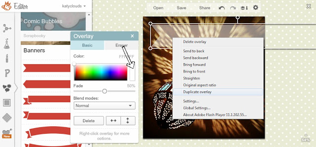
I've faded out the bottom overlay to blend it more into the image. Nice huh? I used a 50% fade. Next, duplicate the overlay by right clicking and selecting 'Duplicate Overlay'. Make it a bit smaller (trial and error will help here!) then think about colours. I used the light blue shade visable in one of this beautiful Morrocan light's shade. It's not immediately obvious, but if you click in the box that arrow is pointing to, your cursor will become a colour dropper and you can select any colour from your image. This is a great way to get a fully cohesive look.


Use your cursor to move the new coloured banner over the top of the first one. You can experiment with layering three or even four overlays together, altering the fade and colours with each. Position it so there is an even border. Cute!


I like to use this method to make banners for my text.
3. Funk Up Your Text - How to Add a Drop Shadow Effect
I wish that there was the option to add drop shadow and perhaps even an outline glow to the text in Picmonkey, but I've figured out how to DIY the drop shadow. This works with any solid overlay too!


Chose your font, click 'Add Text' and type what you want to say. Lobster Two is one of my favourite free fonts.


Right-click and duplicate the overlay, just as we did before. Now, the first text will be your shadow and the second your actual text. If you want your text to be black you'll need to make the shadow text a deep grey. Otherwise change only the colour of the top text.


Move the coloured text on top until just a teeny bit of the shadow is showing. It's really easy to adjust the angle of the 'lighting', just move around the top text until you are happy.


These little 'dings' to add a bit of sparkle to text - don't be afraid to experiment with all the options! 
Because it's sometimes a hassle to get the shadow text in the right place to start off, I like to make this on a white background (see above) and then crop it right down so there is no additional space. Then I open up the image that I want to add the text to, and use the 'Use Your Own' overlay option. You'll be able to load up the ready made shadowed text and adjust it's size and position as a complete object. Easy!

I hope you had a lovely weekend! I had a great birthday, and I'm doing well with my 29 photos challenge. Are you following me on instagram yet?

This week I have a Valentines craft project that I've been working on for weeks, aswell as more information about my e-course on Social Media for Jobseekers :-)

Similiar Posts...