It's hard to stand out online, fact. There are lots of things that you can do to stand out, many more salubrious than others. Why not start off your week by changing up your online person with a fabulous avatar (you know what that is don't you? That little thumbnail that appears by your content on twitter, facebook, linkedin...etc.) I'm a huge believer that you should maintain the same image across all your social networking. Makes for a more cohesive image and people will be able to recognise you instantly if they have you on a different site.
So, I posted a little while ago on how to make any picture perfectly round with Picmonkey. I thought it would be fun to show a few more techniques that Picmonkey has to offer to awesome up your avatar.
Super easy! I have my Facebook avatar like this, and I always get questions about it. I thought it would be a great one to start off with. Simply load up your image...
See that little pumpkin on the bottom of the left hand column? Clicking it will give you a whole bunch of fun effects and overlays. Click the pumpkin, and then scroll down to the 'Sweethearts' section. This is where you will find the 'Heart Cutouts' option. See is there at the bottom?
Click it, and your face will be framed by a heart with a spotty pink background. I changed mine to white use the sliders at the bottom left of the sreen. Use 'Color' instead of swatch.
Save your file as a 'jpg' or you'll get a funny fuzzy edge to the heart. Here's how mine looks at the moment:
So easy right?
This is a great idea if you are branding yourself online, use your thumbnail to advertise your brand or your blog! It helps to have a shorter name. If you name is Charlene Whippersnapper you might struggle making the text visible :(
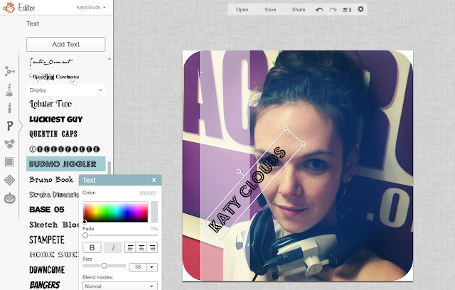
Start off with a picture that represents what you are all about. I've rounded the corners because I'm stuck in 1999 and I think it looks cute. Don't judge. The fifth icon down on the left hand bar is a little group of three shapes. That's your overlays. The first option is geometric and I use that the most! I picked a rectangle and sized it on my image. I also twisted it 90 degrees because I want the text up the side. It's super easy to experiment with positions on Picmonkey, so have a play around and see what suits your image best.
Fade it out! Make your text pop without distracting from your image by fading your text background to 50%. I use this technique all the time to add clear text to pictures that I know are going to come up small.
Next choose a font. Big, blocky fonts are obviously a better choice, as your thumbnail is going to be teeny especially on phone screens. I think Budmo Jiggler is one of my all time favourite fonts, but BASE is a great option too. I would seriously recommend a Royale membership to Picmonkey just based on the amazing font options. I did a little swivellyness on my text, that's the little arm sticking up out of the top if you can't work it out.
Done. Great for Linkedin and Google+ in my opinion :)
Selective colour is one of my favourite effects when used right :)
Selective colour is one of my favourite effects when used right :)
Start with a full colour image. Load it up into Picmonkey.
The second little icon down on the left hand navigation bar is a little vial of bubbling liquid. That's where you will find the effects. Black and white is a free one.
Next to the 'Fade' slider you'll see a little paintbrush. It's this that you can use to remove the black and white filter on the sections that you want You can adjust the size and density of your eraser brush too. It makes for a fun effect on an avatar.
I hope you have enjoyed these three techniques to make your thumbnail picture fabulous! Don't be shy about leaving a comment :)
Yes, I know. I made a deal about posting pictures of myself online and here is a post full of pictures of me, I'm nothing if not inconsistant eh?
I have not used any of Picmonkey's Royale effects in these suggestions. However I do have a Royale account courtsey of the wonderful people at Picmonkey.
Yes, I know. I made a deal about posting pictures of myself online and here is a post full of pictures of me, I'm nothing if not inconsistant eh?
I have not used any of Picmonkey's Royale effects in these suggestions. However I do have a Royale account courtsey of the wonderful people at Picmonkey.


No comments:
Post a Comment